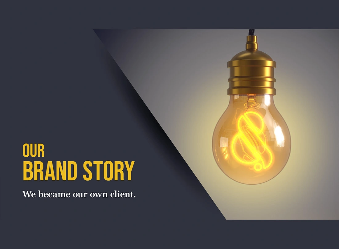
It’s the age-old scenario in our industry – you’ve sat through a perfectly polished pitch, only for the work to come back competent, inoffensive and somehow not quite you. Creative that could’ve been delivered for a dozen other brands.
This approach is exactly what Grit & Pearl is relentlessly working against. We dig deeper, refuse to take a brief at face value and deliver with zeal. And, to prove it, we became our own client in order to reflect this spirit, work ethic and fortitude.
We caught up with two of the brains behind our rebrand – Grit & Pearl’s Managing Director Rob Roach and Creative Director Antony Smith. Below, they talk about the new brand and what it means for the customers we work with.
A promise before a logo
Grit & Pearl was founded on a specific conviction: that great creative work is not a happy accident. Rob Roach explains that –
That philosophy needed a name. Grit – the tenacity to go beneath the surface. To understand a brand’s consumer, its category, the context in which it competes. To keep going when the obvious answer presents itself, because the obvious answer is rarely the right one. Pearl – the reward that comes from that work. Not simply decoration or a consolation prize, but genuinely a beautiful result that only emerges when the effort has been real.
Together, they describe not just a way of working but a guarantee: if you commit to the grit, you earn the pearl.
But, what does the process of the grit and the pearl look like in reality? Well, we did something that most agencies talk about, but few actually do: we became our own client.
The making of a brand – We became our own client
As an agency, we spend most of our working week talking about brand. We knew we needed to dig deep and get the whole team rallying behind one idea. Rob Roach explains an important part of the process;
When you truly understand what you stand for, decisions that would otherwise take weeks take minutes. Things feel on-brand or off-brand almost instinctively. The brief becomes a compass rather than a constraint.
The jewel in the logo
The logo needed to capture and communicate the duality of Grit & Pearl. And that’s when the ampersand – or what we call “the jewel” – comes into play.
The jewel is also a clever visual construct between the letterforms G and P:
The colours
Grit & Pearl’s colours had to withstand the test of time. That’s where the dark anthracite came from. But then we needed to capture the personality, the spark and optimism of our team. And that’s why we chose the saffron yellow. The idea was not to be afraid of that creativity, not to shy away from the spark.
Antony explains how this is also reflected in client work:
The type
Choosing the right typography to reflect the essence of the brand felt natural, as Rob describes:
Bebas Neue is robust and tenacious, which speaks to the Grit side of things. Meanwhile, Georgia Pro is highly scalable and legible without being overly decorative.
What this all means for you; It would be easy to read all this as branding people being precious about branding. But, we wanted to demonstrate that we went through the same process we’d ask of any client. We found it just as demanding, just as uncomfortable, and just as necessary. We didn’t take shortcuts with our own brief, which is a reasonable indication of how we’ll treat yours.